Lifeline - UX research for a mobile app

Lifeline - UX research for a mobile app

Lifeline - UX research for a mobile app

“Lifeline” is an application made for people and this is the approach I took. I have gathered both, quantitative and qualitative data to help me understand users’ needs and pain points. My main goal has been targeting as many social categories of users as I could.


Their feedback influenced the way “Lifeline” has been designed and what are the solutions for their pain points. I wanted to make a simple, user friendly and easy to use app and from my point, I succeeded in achieving this.

User research

Competitive analysis

Personas

Information architecture

User flow

Sketching

Wireframes

Prototyping

User testing

Role

UX researcher

What

Mobile application (IOS)

Why

Personal project

Team members

Designer

Category

App

When

Dec 22 - Jan 23

Problem statement

Problem statement

Problem statement

The Lifeline app, driven by a user-centric approach, addresses diverse user needs across five categories—holidaying, gathering, studying, saving and spending, and eating. Informed by both quantitative and qualitative research, the aim is to offer tailored solutions to users' pain points. As there is no existing app with the same comprehensive functionalities, the challenge is to create a streamlined platform that facilitates efficient planning and execution of up to three life activities for users across various social categories.

The Lifeline app, driven by a user-centric approach, addresses diverse user needs across five categories—holidaying, gathering, studying, saving and spending, and eating. Informed by both quantitative and qualitative research, the aim is to offer tailored solutions to users' pain points. As there is no existing app with the same comprehensive functionalities, the challenge is to create a streamlined platform that facilitates efficient planning and execution of up to three life activities for users across various social categories.

Solution

Solution

Solution

The solution offered by the Lifeline app is a streamlined platform that empowers users across social categories to efficiently plan and execute up to three life activities, ranging from holidaying and gathering to studying, saving and spending, and eating. Through intuitive design informed by quantitative and qualitative research, the app provides tailored tools and features that address users' unique pain points, enhancing their ability to manage diverse aspects of their lives seamlessly. By offering a unified, user-friendly interface, Lifeline aims to simplify the organization of life activities while fostering a sense of empowerment and efficiency for users.

Team and role

Team and role

Team and role

As a UX researcher, my role focused on delving into user behaviors, needs, and preferences to uncover valuable insights that shaped the development of products. Through a blend of quantitative and qualitative research methods, I examined user interactions, pain points, and motivations to provide actionable recommendations. By bridging the gap between users and design, my role contributed to creating user-centric solutions that enhanced the overall user experience.

As a UX researcher, my role focused on delving into user behaviors, needs, and preferences to uncover valuable insights that shaped the development of products. Through a blend of quantitative and qualitative research methods, I examined user interactions, pain points, and motivations to provide actionable recommendations. By bridging the gap between users and design, my role contributed to creating user-centric solutions that enhanced the overall user experience.

Data gathering

Data gathering

Data gathering

To get both quantitative and qualitative data, I conducted a survey, interviewed my friends, and used some of the most popular competitor applications as reference.


As there is no such application that has the same functionalities as “Lifeline” or can assist people with organising maximum 3 life activities, I decided to split the research by categories that correspond with the 5 activities “Lifeline” is assisting with.


These categories are:

1.    Holidaying – Going on holidays, traveling, or booking a hotel.

2.    Gathering – Organising events such as parties or going on a trip.

3.    Studying – Learning about new subjects, skills, or jobs.

4.    Saving and spending – Managing users spendings and expenses.

5.    Eating – Preparing a meal or ordering food.

Competitor analysis

Competitor analysis

Competitor analysis

The competitor analysis consisted in conducting market research and finding the key competitors. As said before, there is no such application that would be similar to “Lifeline”, and I found the main competitors and their strong and weak points for each category.

The competitor analysis consisted in conducting market research and finding the key competitors. As said before, there is no such application that would be similar to “Lifeline”, and I found the main competitors and their strong and weak points for each category.

Holidaying

Holidaying

Holidaying

Main competitors in the holidaying category are Airbnb, Booking.com, and TripAdvisor.

Main competitors in the holidaying category are Airbnb, Booking.com, and TripAdvisor.

Gathering

Gathering

Gathering

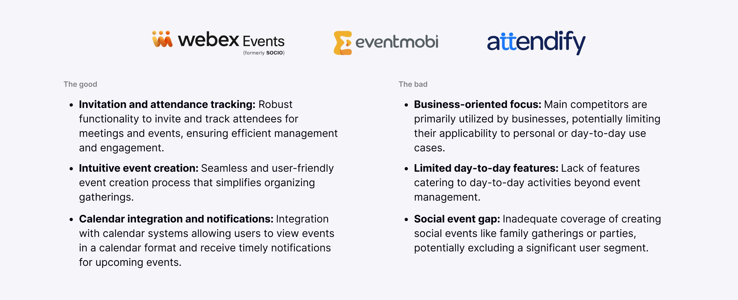
Main competitors in the gathering category are Socio, EventMobi, and Attendify. Because of the small number of people using these kinds of applications, they are mainly used by businesses and have the same functionality.

Main competitors in the gathering category are Socio, EventMobi, and Attendify. Because of the small number of people using these kinds of applications, they are mainly used by businesses and have the same functionality.

Studying

Studying

Studying

Main competitors in the studying category are: Udemy, Coursera, and Linkedin Learning. All these applications have the same functionalities, but with a different design.

Main competitors in the studying category are: Udemy, Coursera, and Linkedin Learning. All these applications have the same functionalities, but with a different design.

Saving and spending

Saving and spending

Saving and spending

Main competitors in the saving and spending category are: Monefy, Mint, and Wally.

Main competitors in the saving and spending category are: Monefy, Mint, and Wally.

Eating

Eating

Eating

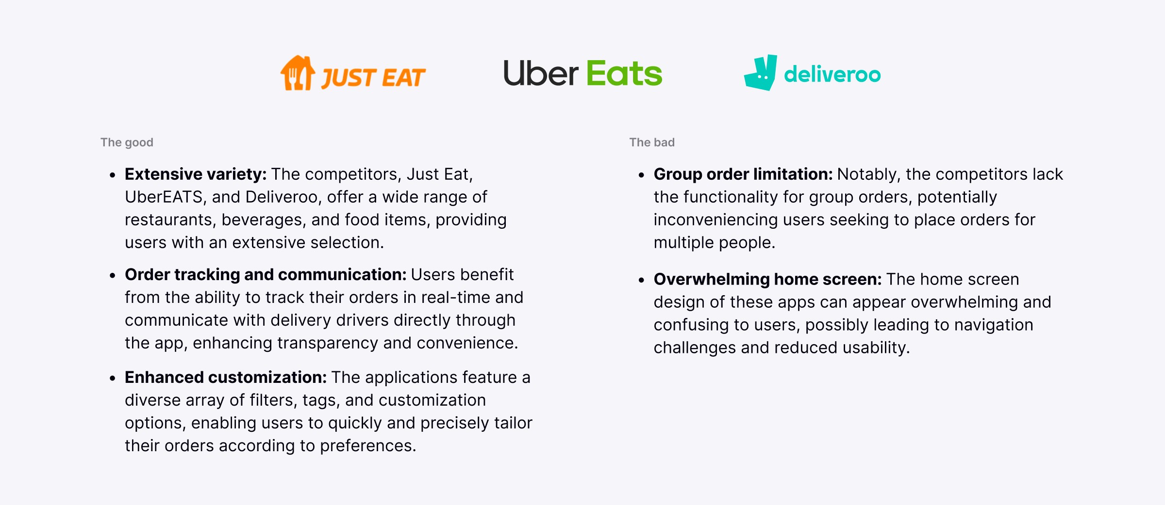
Main competitors in the eating category are: Just Eat, UberEATS, and Deliveroo. All these three apps are very similar and even their functionalities are practically the same.

Main competitors in the eating category are: Just Eat, UberEATS, and Deliveroo. All these three apps are very similar and even their functionalities are practically the same.

User research

User research

User research

Once I had the competitive research and observation table done, I conducted user research to gather quantitative and qualitative data and better understand the needs, demographics, and pain points of users that have experience of utilizing the selected competitor applications. I interviewed a total of 5 persons and got a number of 21 people that took my survey. With the purpose of minimising the errors in collecting and understanding the data, I decided to combine the results from the interviews and questionnaires.


Interviewers were asked the following key questions:

  • How do they go about booking a holiday, learning a new subject, managing money, preparing a meal, ordering food, and organising and event?

  • What application have they used to do the above activities?

  • What is their experience of using those applications, what did they like or dislike about the applications they have been using?


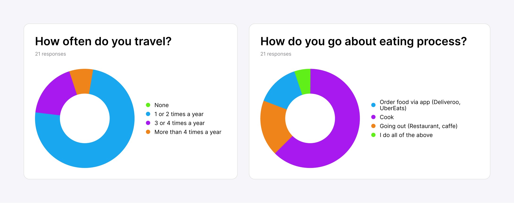
Survey consisted in a series of questions with a further analysing of gathered data by using Google Forms and different types of charts.

Key findings from data gathering

Key findings from data gathering

Key findings from data gathering

Competitor analysis helped me reach a better understanding of the market and find out the main competitors. “Lifeline” is challenging well established brands and the importance of keeping track with the competitors and adapt to the new market changes is vital. The main strategy was finding the opponent’s weak and strong points and trying to improve them to attract more users.


By analysing the competitor’s data first, I was able to create a questionnaire, that was focused on defining user requirements and finding possible trigger points that would make them start using “Lifeline” application in managing their activities.


After completing the data gathering phase, I started putting all the data together and analyse it. The key findings are as follow:

  • Over 60% of people think that pricing of a certain product or service is a deciding factor in booking a holiday or buying something.

  • 70% of the interviewers are attracted by images and reviews.

  • Over 70% would like to get notified about new offers, tips and suggestions, however they do not want to get spammed by them.

  • Over 80% are willing to learn a new skill as coding rather than studying a new language or job. Majority find videos an easier way to understand the information, regardless the difficulty of the subject.

  • Over 70% do not use a banking app.

  • Over 60% prefer to cook rather than going to a restaurant or order something online.

Trigger points:

Trigger points:

Trigger points:

  • Affordability - Pricing is an important factor in any activity, one of the main functions of the “Lifeline” application should be creating a flexible filter with different pricing options suitable for every social class. Other ideas would be to send users notifications with discounts, sale offers and try to push lower and middle budget products.

  • Visualisation – Using images, videos, and illustrations. Not all competitors have visual elements, which I think is essential for travel, event, studying and eating applications.

  • Reviews – Using a developed and trustworthy review system. Everything is digital now and users can be pushed away because of the lack of trust in a service or product.

  • Gamification – A reward system and gamification of a certain function of the application would challenge people use “Lifeline” more often. I deducted that more than 70% of people I interviewed did not use a money managing application, however more than 90% believe that a reward system and gamification would motivate them use such an application. The same approach can be taken to motivate users in using “Lifeline” for any other life activity.

  • Simplicity – Majority of the competitor applications present a complex and overwhelming way of showing search results. By simplifying the way “Lifeline” will display the search results and other data, will help users to navigate easier through the app and find faster what they will be looking for.  

  • Personalisation – Giving users a way of personalizing their journey by collecting their preferences when they first log in. Another way of personalizing the app is the constant user data gathering, this means analysing their most popular searches or time spend managing a certain activity.

  • Sharing and communication – Most of the users do their life activities in a group, and majority of them are forced to use a different application to share or communicate to their friends, family, or colleagues. Creating a chat within the app would be another trigger point to use “Lifeline”. Having a chat functionality also means that users would be able to contact the host of the property they booked, a native from the region they travelling to or other users with same interests.

  • Helping – Sending users tips with things they would need on a trip, places to visit or activities to do.

Personas

Personas

Personas

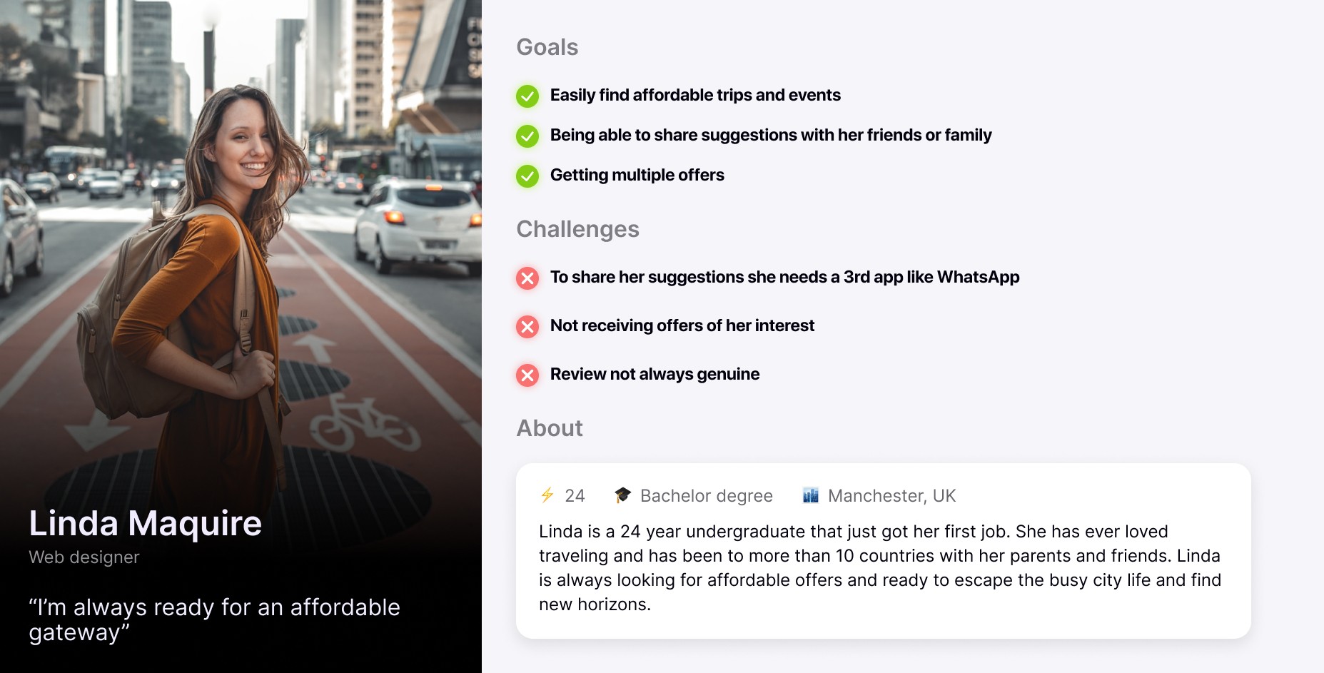
With the research conducted thus far and the insight provided by the participants, I came up with some user personas that that reflect the different needs and pain points that were brought up earlier. I chose to make 2 personas for the most popular activities, holidaying and eating.

With the research conducted thus far and the insight provided by the participants, I came up with some user personas that that reflect the different needs and pain points that were brought up earlier. I chose to make 2 personas for the most popular activities, holidaying and eating.

Linda, first persona reflects most of the users that are using travelling applications. She is looking for an affordable vacation with her friends or family. Her main goals would be getting notifications with multiple sale offers and tips. However, she is frustrated by the fact that majority of the travel applications do not have a chat functionality and needs to use a 3rd party application to share travel suggestions.

Linda, first persona reflects most of the users that are using travelling applications. She is looking for an affordable vacation with her friends or family. Her main goals would be getting notifications with multiple sale offers and tips. However, she is frustrated by the fact that majority of the travel applications do not have a chat functionality and needs to use a 3rd party application to share travel suggestions.

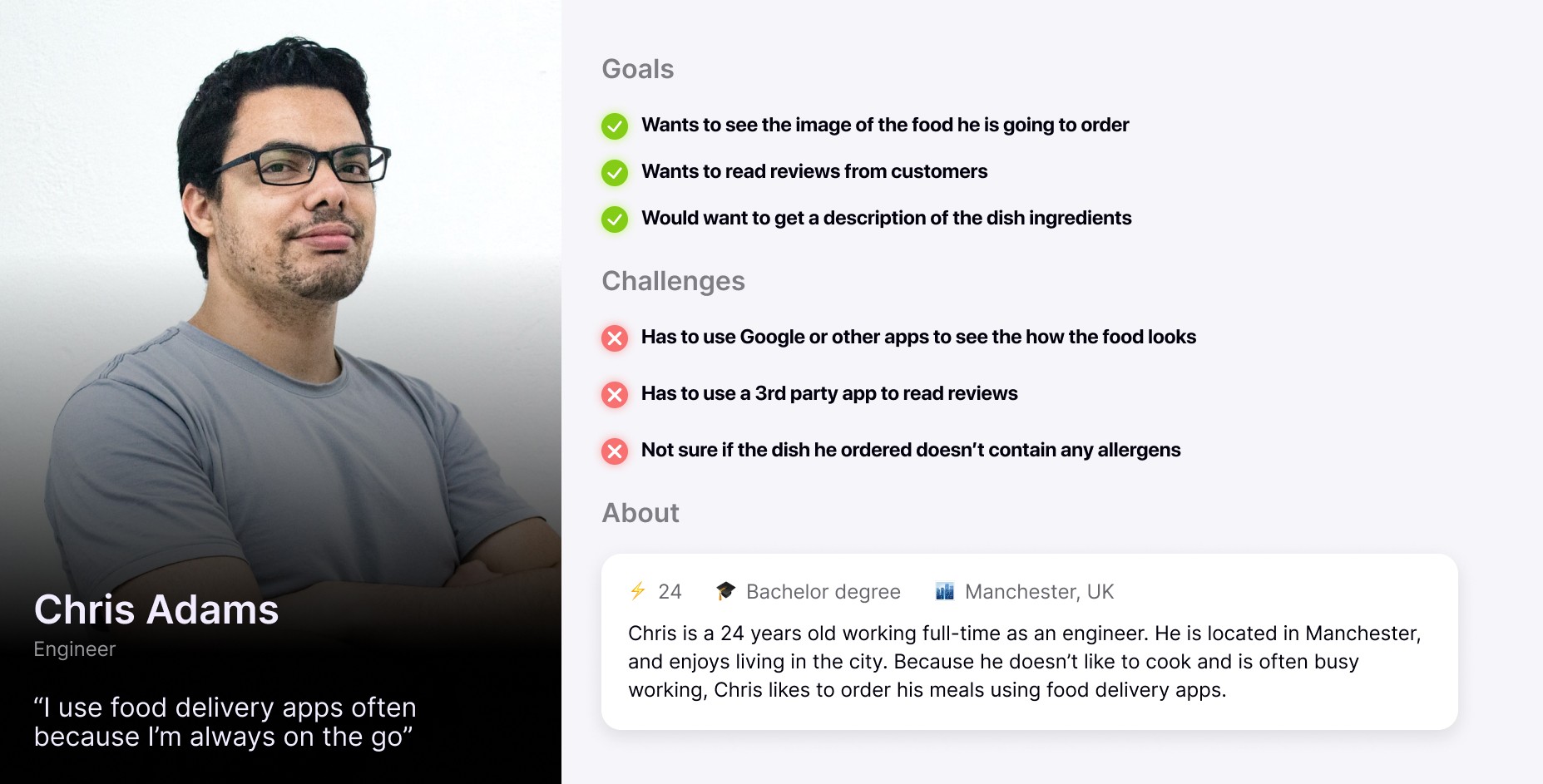
Chris represents the users that will make use of eating functionality that “Lifeline” will offer. He is a proud user of delivery applications and likes to try new dishes, however the absence of images and reviews makes him skip some potential delicious dishes. Also, being allergic to some ingredients, is important for him to know if the dish he ordered has any allergens.

Chris represents the users that will make use of eating functionality that “Lifeline” will offer. He is a proud user of delivery applications and likes to try new dishes, however the absence of images and reviews makes him skip some potential delicious dishes. Also, being allergic to some ingredients, is important for him to know if the dish he ordered has any allergens.

Sitemap

Sitemap

Sitemap

“Lifeline” is using a “standard” site map. I decided on not creating a completely different site map to the “Lifeline” competitors because users are used with a way of navigating through different travel, eating and other types of activity apps and any changes to their ordinary way of managing their activities may make them want to leave “Lifeline”.

“Lifeline” is using a “standard” site map. I decided on not creating a completely different site map to the “Lifeline” competitors because users are used with a way of navigating through different travel, eating and other types of activity apps and any changes to their ordinary way of managing their activities may make them want to leave “Lifeline”.

User journeys

User journeys

User journeys

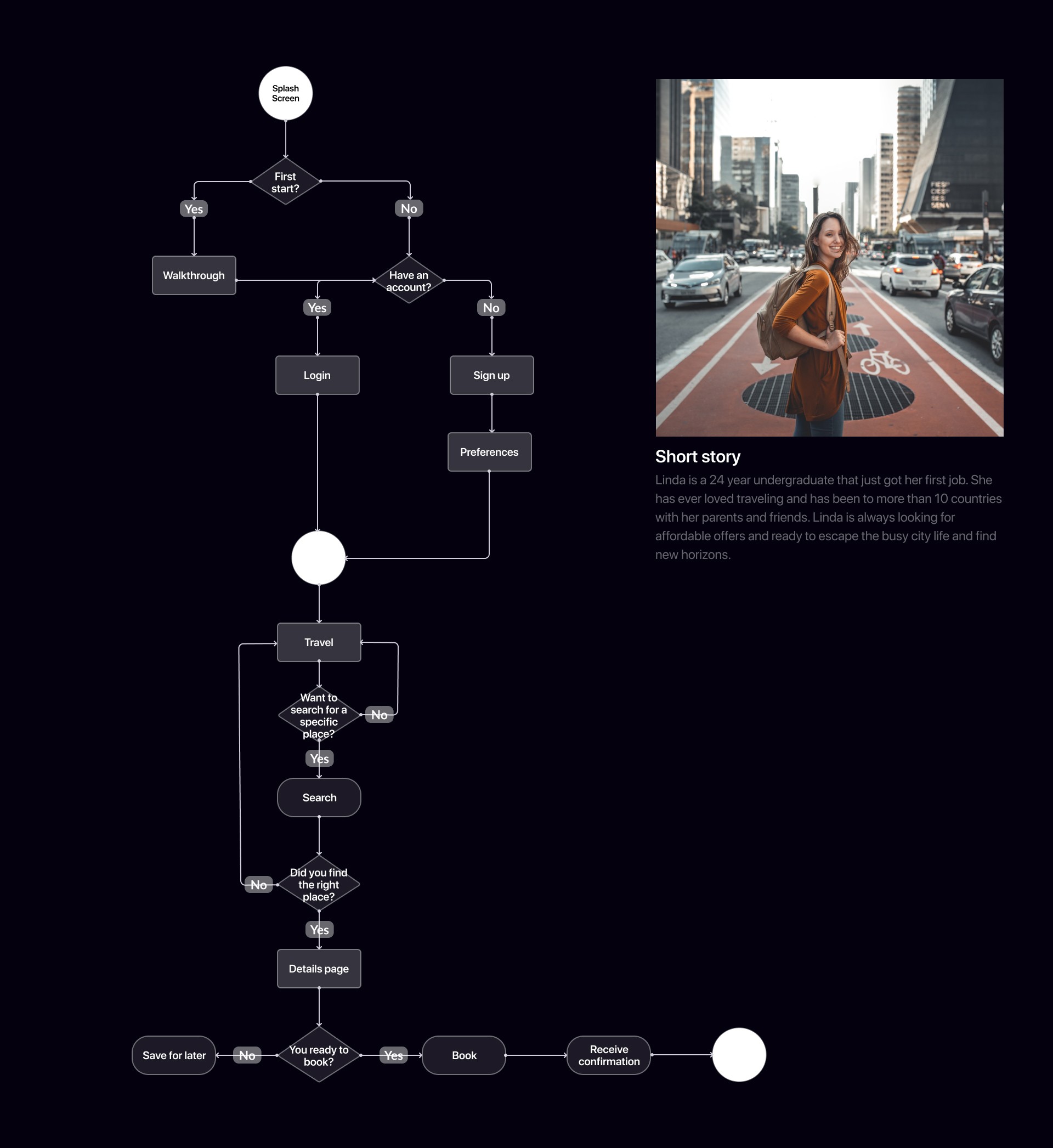
User journeys is represented by 2 user flow diagrams, which was made based on the personas and their needs and the site map. I have decided to focus the user journey on holidaying and eating activities, because these activities are expected to attract the most users to “Lifeline” application.

User journeys is represented by 2 user flow diagrams, which was made based on the personas and their needs and the site map. I have decided to focus the user journey on holidaying and eating activities, because these activities are expected to attract the most users to “Lifeline” application.

Book a holiday journey

Book a holiday journey

Book a holiday journey

When first downloading the application, users will have to take a short walkthrough to get a better understanding of how “Lifeline” can help them with their day-to-day activities. In my opinion this is a key step to ensure that users that are not familiar with such applications to know where to start at.


The above image shows the user journey for booking a holiday. Users have several decisions and turns to take to the moment they finish their journey, however I tried to keep it short and simple, as majority of users may not have time to take a lot of steps and easily get annoyed.


All holidaying application functionality is focused on the search functionality and flexible filtering options. Regardless the page, users will always be able to search for other options. If users found a holiday option, but they are not ready or sure if they want to book it, they will be able to save it in favourites and share with friends and family later.


The booking process finishes with users receiving a confirmation pop-up and getting notified that their holiday has been booked and added in their calendar. Further notifications will follow with tips, guides, and reminders.

Order food journey

Order food journey

Order food journey

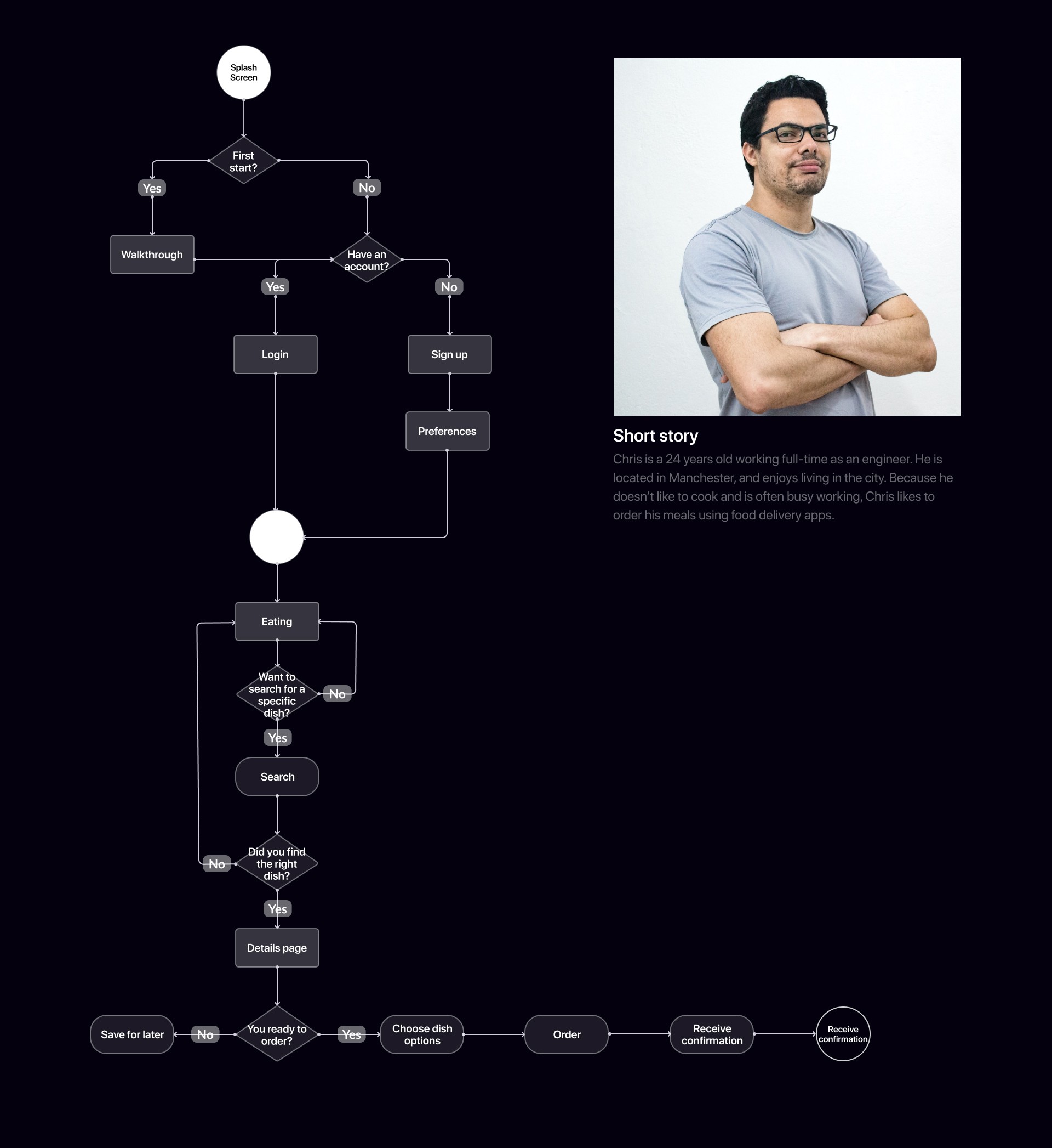
The second user journey represents how users can search and order food. As in the example above, main functionality are flexible filters and search. Users will start on the home page, then navigate to eating page, where they will find different dishes, categories, and restaurants, based on their preferences and location. Besides being able to filter and search through dishes, users will be able to choose any add-ons or remove some ingredients. This customisation will improve the user journey in a positive way and offer a feeling of being in control of what can be ordered.

The second user journey represents how users can search and order food. As in the example above, main functionality are flexible filters and search. Users will start on the home page, then navigate to eating page, where they will find different dishes, categories, and restaurants, based on their preferences and location. Besides being able to filter and search through dishes, users will be able to choose any add-ons or remove some ingredients. This customisation will improve the user journey in a positive way and offer a feeling of being in control of what can be ordered.

Prototype validation

Prototype validation

Prototype validation

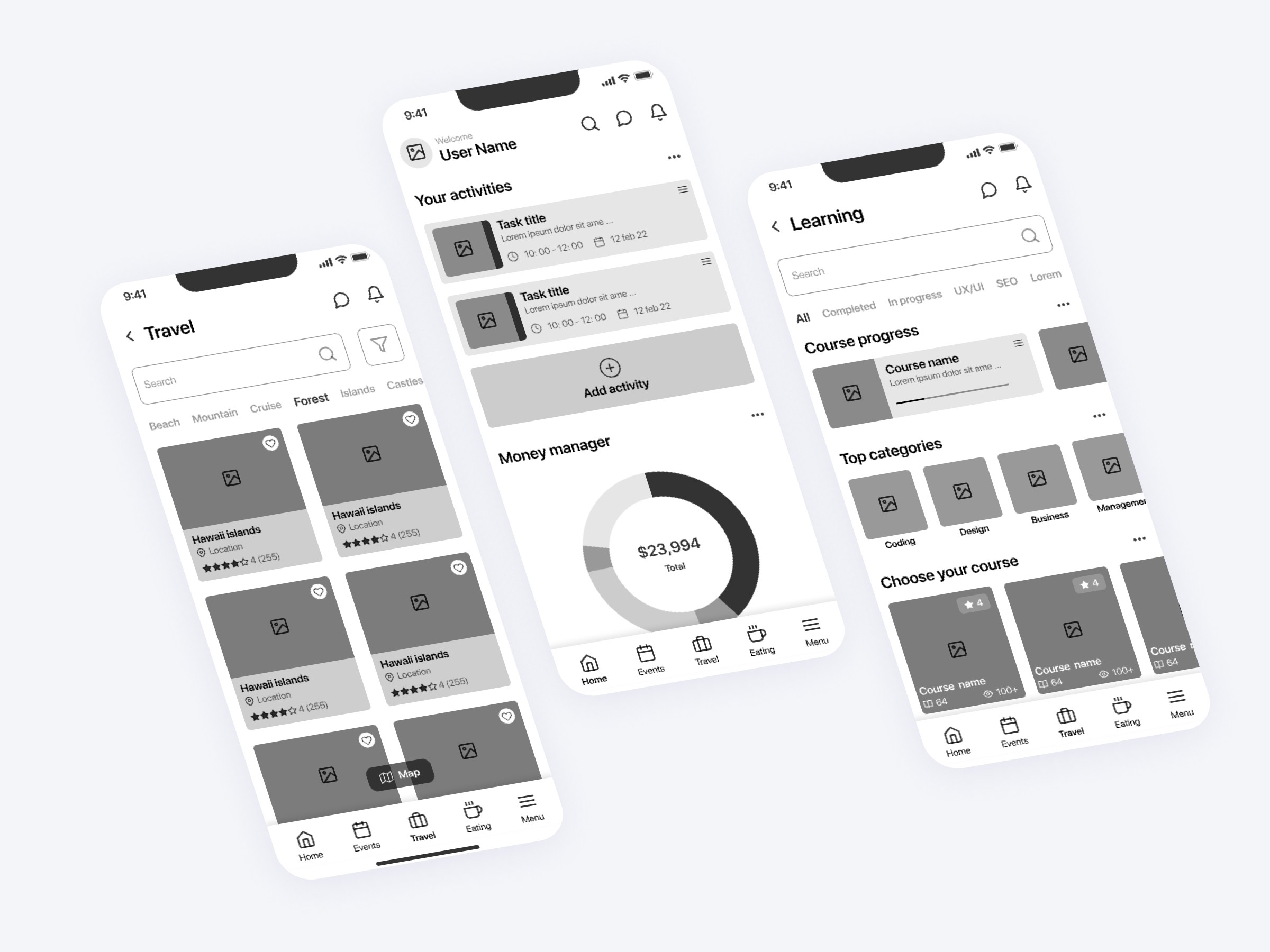
Key objectives of the prototype validation process were to gather qualitative data from users that had a look on the wireframes and improve the user journey. I have asked my friends to conduct a user testing using the walkthrough technique. They had to complete different activities such as booking a holiday or starting a new course. Main goal was making all these tasks easy to complete and user friendly. After the user testing has been done and data analysed, I got this feedback on what users liked:


  • Being able to do navigate fast through the app using “Menu” tab.

  • Being able to search holiday offers on a map.

  • Being able to study watching videos.

  • Being able to save offers or suggestions.

  • Being able to invite other people to an event or activity.

  • See their course progression.

  • User liked the idea of getting travel tips and guides.

  • Being able to customise their dish and see the allergen ingredients.

  • Watching tutorials and learn how to cook a certain dish.

  • Application has a reserved space for visual elements which will improve the user experience.


Figma prototype [link]

Outcome

Outcome

Outcome

The outcome of the Lifeline app project is a dynamic and user-centric platform that effectively addresses the diverse needs of users across various social categories. By synthesizing quantitative and qualitative research insights, the app is meticulously designed to streamline the planning and execution of life activities in five distinct categories—holidaying, gathering, studying, saving and spending, and eating. The app's outcome reflects a commitment to simplicity, usability, and tailored solutions that empower users to navigate their daily activities seamlessly.

Key Takeaways

Key Takeaways

Key Takeaways

  • User-centric approach: The project's success stems from a deeply rooted commitment to understanding users' diverse needs and pain points across various social categories.


  • Data-driven insights: The integration of both quantitative and qualitative research methods provided valuable insights that informed the app's design and functionality, ensuring that it addresses users' unique requirements effectively.


  • Future growth: The successful launch of the app creates a foundation for future expansion, offering opportunities to introduce new features, enhance personalization, explore monetization models, and potentially expand to different regions.

Design recommendations

Design recommendations

Design recommendations

  • Lifestyle Images: The integration of lifestyle images in the app's design offers users a relatable and immersive experience. These images provide context and resonate with users' daily activities, enhancing engagement and emotional connection.


  • Consistent Icons: A uniform icon design approach has been adopted, ensuring that icons maintain the same stroke thickness and design style throughout the app. This consistency fosters a cohesive visual language, aiding users in quickly recognizing and comprehending different functionalities.


  • Warm Colour Palette: The choice of a warm colour palette contributes to a visually inviting and harmonious interface. Against a clean white background, this palette ensures optimal contrast, readability, and a welcoming user environment.


  • Clickable Element States: To improve user understanding and engagement, different states have been developed for clickable elements. When users interact with buttons or links, these states visually indicate the action, such as a change in color or animation, providing immediate feedback.


  • Transition and Micro Interactions: By incorporating smooth transitions and micro interactions for clickable elements, the app offers a responsive and delightful user experience. These animations provide visual feedback, ensuring users are aware of their actions and interactions.

Conclusion

Conclusion

Conclusion

In conclusion, the Lifeline app project embodies the power of user-centric design and data-driven insights to create a versatile and impactful solution for users across a diverse range of social categories. Through comprehensive research, meticulous design, and a commitment to simplicity, the app streamlines the process of planning and executing up to three life activities, empowering users in their daily lives.


The project's success not only marks the achievement of a valuable solution but also sets the stage for future growth, innovation, and continued improvement based on user feedback. By bridging technology with user needs, the Lifeline app underscores the transformative potential of design in enhancing users' everyday experiences and contributing to their overall well-being.

Ready to Elevate Your Project?

Let's bring your design vision to life.

© Valentin Ciugureanu 2023

Ready to Elevate Your Project?

Let's bring your design vision to life.

© Valentin Ciugureanu 2023